Your Product Ships in Days. Your Embedded Analytics Can Too.
How AmpUp built an embedded ThoughtSpot dashboard that looks like our own product, using Muze charts, Embed style customizations, and an API and MCP driven workflow.
A bit of personal context before the story. Back in 2022 I helped prototype and build Spotter , ThoughtSpot’s natural-language analyst, working alongside Amit Prakash, with whom I went on to co-found AmpUp, where he is founder and CEO. A good chunk of that work on turning plain questions into queries lives in our patents on natural-language question answering . So there is a particular delight in what follows: years later, building a different company, we reached for ThoughtSpot to power analytics inside our own product, and it turned out to be exactly the right tool for the job.
TL;DR
Modern product teams ship polished, on-brand screens in days. Embedded analytics usually does not keep up. The default customization surface across BI tools is colors, fonts, and labels, and anything bespoke means a separate custom-visual build. We wanted our learning and development analytics to look like AmpUp, not like an embedded BI tool. Using ThoughtSpot ’s Muze charts (tiles you author as code), Embed style customizations (your brand and fonts inside the iframe), and an API and MCP driven loop (the dashboard is a text file an agent can edit), we closed the gap at product speed.
The mismatch nobody talks about
At AmpUp we build product fast. With AI-assisted design, a polished on-brand React screen is no longer a multi-week cycle. You describe it, you get it, you refine it in a conversation.
Then you add analytics, and the experience breaks down. The embedded dashboard looks like the BI tool, not your product: default bars, a generic donut, KPI tiles that show a bare number with no context. You reach for customization and find colors, fonts, and labels. The look and feel that makes a screen feel like yours barely moves.
We wanted to find out whether that ceiling is real, and whether it had to be.
Is “you can only change colors and labels” actually true?
Mostly, and the nuance is the whole point.
Every embedded BI tool gives you a theming layer: colors, fonts, label formatting, per-visual style tweaks. That is the supported, easy path, and it is where most teams stop because the next step is a wall.
- Power BI themes cover colors, fonts, and per-visual-type styling. That is comprehensive within Power BI’s built-in chart catalog. Rendering something that is not one of those visuals means building and packaging a custom visual through their SDK.
- Tableau embedding offers toolbar and filter control plus dashboard-object formatting like padding, borders, and corner radius, with documented limits on matching an external app’s look and feel.
So the claim holds for the default path across the category, ThoughtSpot’s own default theming included. Going truly bespoke normally means dropping into a custom-visual SDK: a separate, slow build of exactly the kind modern product teams have otherwise eliminated.
The real question was never “can colors change.” It was whether we could get product-grade, bespoke dashboards without that separate slow build.
The test case: an enablement analytics dashboard
AmpUp does sales enablement, which means courses, roleplays, and quizzes, so enablement managers need to see how their teams progress through learning. We already had a target, designed in our product’s language. The actual source file is linked at the bottom of this post.
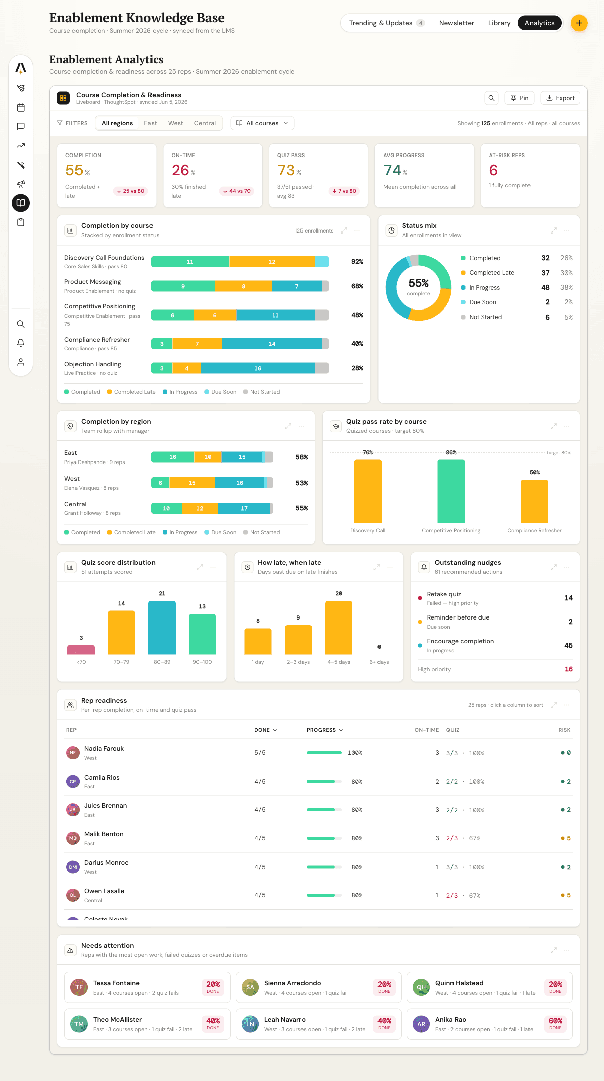
Teal and gold palette, horizontal stacked completion bars with row totals, a donut with the completion rate in its center, a KPI band where each metric carries a target delta, and rich rep-readiness and needs-attention tiles. This is what “looks like our product” means, and it is not what any BI tool hands you by default.
The starting point: a functional but generic embed
We model the data in ThoughtSpot as an enrollment-grain view, then a worksheet, then a liveboard , and embed it in the app. After the standard theming pass, the baseline you would get in any tool, it looked like this:
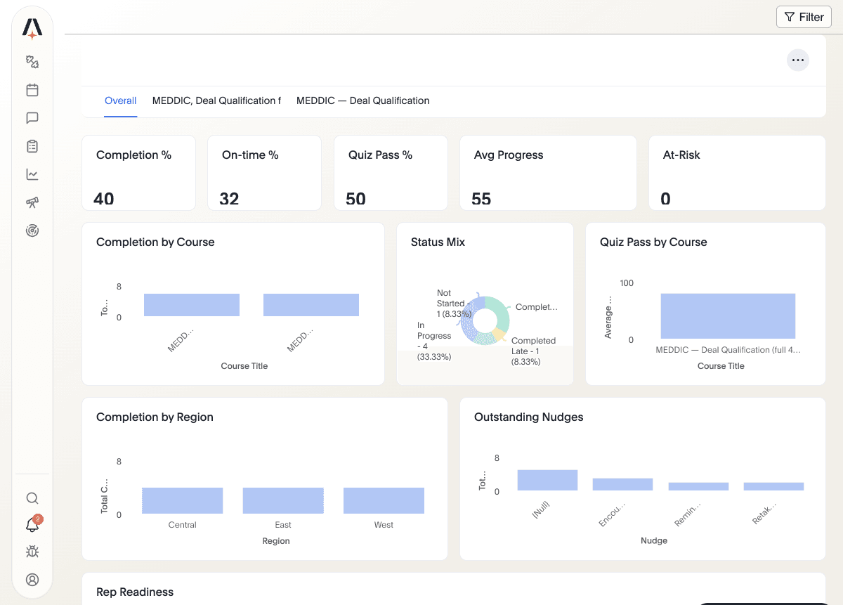
Everything works. The numbers are right, tabs switch per course, filters apply. But it reads as a BI tool sitting inside our app. Side by side with the mockup, the gap is the gap between default theming and your product. The interesting part is what ThoughtSpot let us do next, which most tools do not.
Where we landed: the same data, our product’s look
Here is the result: same liveboard, same data, embedded the same way, styled to the mockup. The KPI strip became an “At a Glance” card band where each metric shows its value, a tone-colored percentage, a sub-caption, and a target-benchmark pill such as “down 30 vs 80”, all computed live rather than hardcoded. Bars carry the status palette and row-total percentages. The donut shows completion rate in its center. Quiz-pass bars are colored by score band.
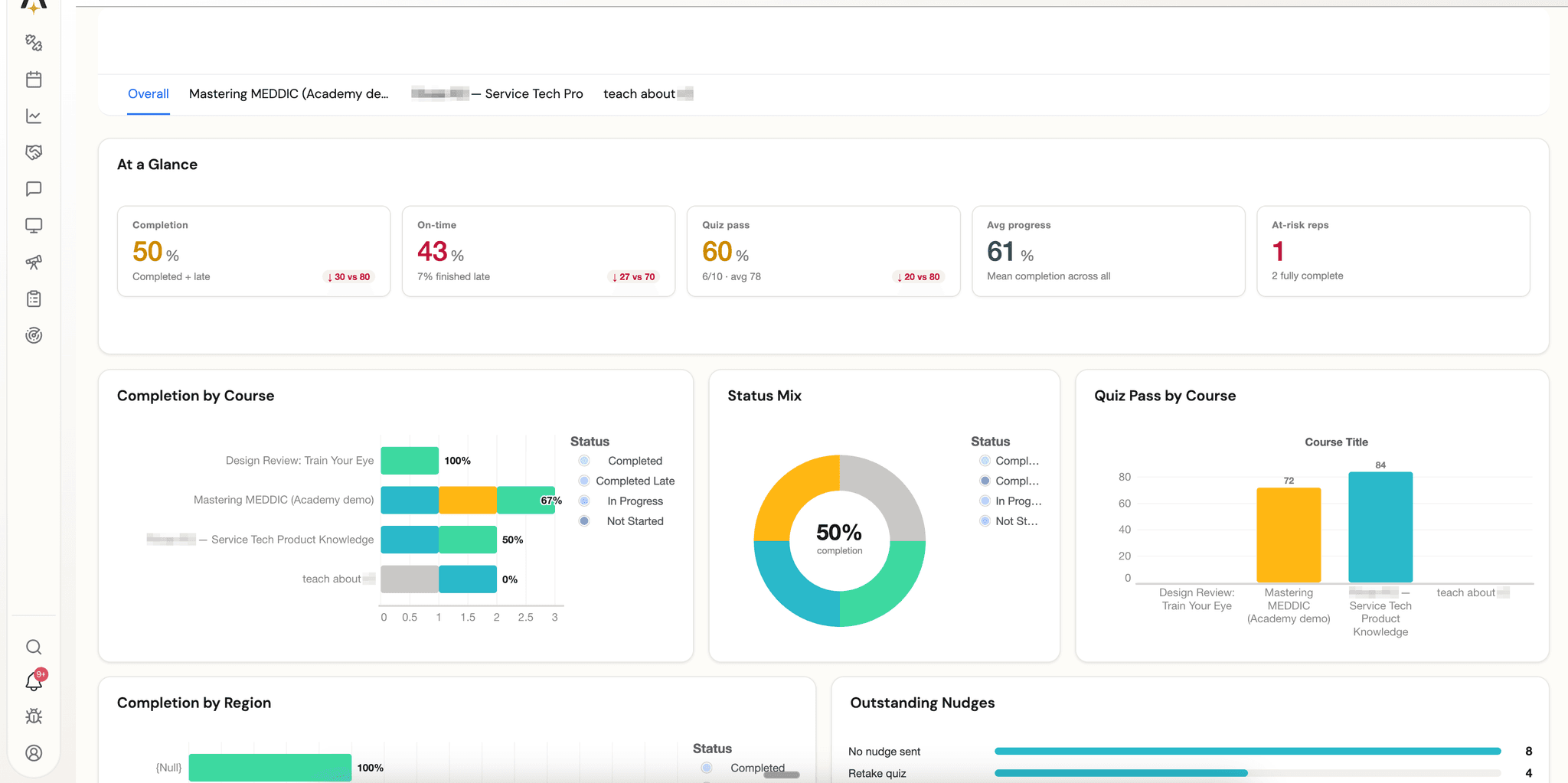
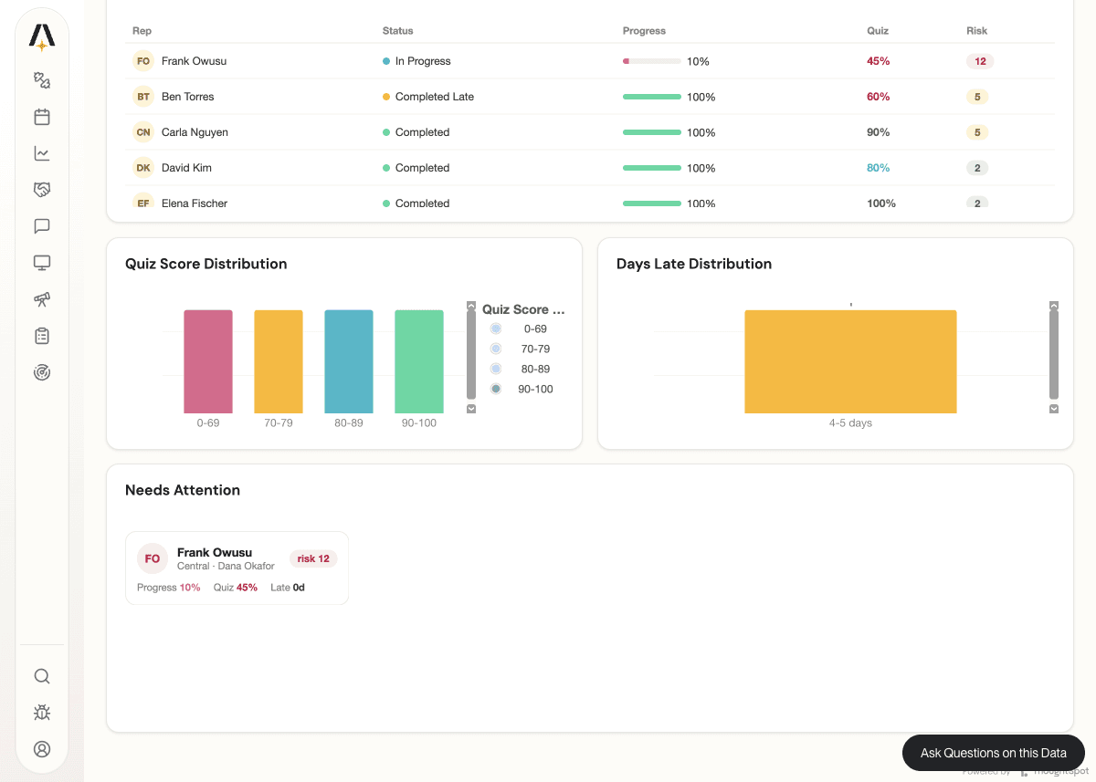
The rich tiles you would never get from a chart catalog came over too: a Rep Readiness table with status dots, progress bars, value-colored quiz scores, and risk badges, plus a quiz-score distribution and a Needs Attention card grid.
That is not a re-themed bar chart. It is our product’s design, rendering live ThoughtSpot data, inside an embedded liveboard.
How it works: three capabilities, one fast loop
1. Muze: tiles you author as code, not pick from a catalog. Muze is ThoughtSpot’s native visualization engine, built on the Grammar of Graphics . The point is not more chart types. It is that a tile can be arbitrary, data-driven HTML and SVG that you write against the query result. That is how the At a Glance band, the rep-readiness table, and the needs-attention cards exist at all:
// A Muze custom chart is just code that runs in the tile.
// Read the query result, then render whatever DOM your product needs.
const rows = getDataFromSearchQuery().getData().data; // enrollment-grain rows
root.innerHTML = rows
  .map(
    r => `
  <div class="kpi-card">
    <span class="label">${r.metric}</span>
    <span class="value" style="color:${tone(r.value)}">${r.value}%</span>
    <span class="pill">${delta(r.value, TARGET[r.metric])}</span>
  </div>`,
  )
  .join("");
For standard charts you stay in the grammar, with canvas().rows().columns().layers([{ mark: "bar" }]). For bespoke tiles you drop to HTML. Either way it is code, versioned with the dashboard. For app-hosted charts there is also the ts-chart-sdk custom-chart route.
2. Embed style customizations: your brand and fonts inside the iframe. ThoughtSpot’s Visual Embed SDK exposes design tokens and a CSS-rule channel, so the chrome (titles, tabs, tables) inherits your product’s look, including loading our product font into the iframe:
init({
  thoughtSpotHost,
  customizations: {
    style: {
      customCSS: {
        variables: {
          "--ts-var-root-background": "#FDFCF7",
          "--ts-var-viz-title-font-family": "'DM Sans', sans-serif",
        },
        rules_UNSTABLE: {
          "@font-face": { "font-family": "'DM Sans'", src: "url(<woff2>)" },
        },
      },
    },
  },
});
3. API and MCP first: the dashboard is a file an agent can edit. This is what turned “possible” into “fast.” The whole liveboard is TML , ThoughtSpot’s text definition, and the REST APIs round-trip it. The inner loop is simple:
export liveboard to TML
  -> swap a tile's chart for a Muze custom chart
  -> import TML back to the same object
  -> verify the rendered rows with the liveboard-data API
  -> repeat
Because every step is an API call, an AI agent could drive the whole loop through MCP tooling: it authored the Muze tile, imported it, verified the rendered rows, and iterated, all in conversation, with no manual export and reimport in a UI. (ThoughtSpot also ships its own MCP server for agentic, natural-language analytics, which is the same direction applied to querying rather than authoring.) The definition lives in version control and rebuilds itself per organization through our provisioning code. The design iteration moved at the same speed as the rest of our product, because the dashboard became something an agent edits the way it edits code.
The honest part: what is easy and what is not
The loop is fast. Write a tile, push it through the API, look at it, adjust. The tiles themselves are frontend work: a bespoke HTML table takes about as much effort as building that table anywhere, and matching a palette exactly takes the normal amount of design iteration. A couple of mockup details, like per-rep sparklines, are blocked on data we do not yet compute, not on styling. What we did not have to do was stand up a separate custom-visual SDK project or a packaged-extension build, which is precisely the friction that keeps embedded analytics looking dated.
What we would love next: MCP for authoring, not just asking
One gap stood out. Today ThoughtSpot’s MCP server is built for asking questions: natural-language, agentic querying grounded in the semantic model. The authoring loop in this post, exporting TML, swapping in a Muze tile, importing it back, and verifying the result, ran on the REST APIs and our own agent tooling, not on MCP.
The natural next step is to bring the authoring and embedding surface into MCP as first-class tools: TML export and import, custom-chart registration, embed style configuration, and liveboard verification. With those, branding and maintaining an embedded dashboard becomes one continuous conversation with an agent, instead of MCP for the questions and hand-rolled REST for everything else. Having spent years on the query side of this product, that is the improvement we are most excited to see: the same agentic experience ThoughtSpot built for analysis, extended to building.
The takeaway
Embedded analytics looks dated not because your data is boring, but because the default customization surface across BI tools is colors and labels, and the escape hatch is a slow, separate build that modern product teams have otherwise designed away.
ThoughtSpot collapses that gap. Muze lets you author bespoke, data-driven tiles. Embed style customizations put your brand and fonts in the iframe. An API and MCP first workflow makes the dashboard a file an agent can edit. Our enablement analytics now looks like AmpUp, not like a BI tool we embedded, and we got there at product speed.
If you are designing your product with AI and shipping screens in days, your dashboards can keep up. Ours do now.
Resources
- Build it yourself: the Claude skill that walks an agent through this approach (Muze tiles + Embed customizations + TML/REST loop), and the actual liveboard TML we used for the screenshots above (placeholder-based, so it carries no customer data).
- The mockup we imitated: enablement analytics mockup (HTML)
- Muze: Introducing Muze , Use Muze in ThoughtSpot , Custom charts , and
ts-chart-sdk - Embedding and styling: Visual Embed SDK and embedding overview
- Automation: TML , Deploy with TML APIs , REST API v2 , and the ThoughtSpot MCP server (announcement )
- For reference: Power BI report themes , Power BI custom visuals , and the Tableau Embedding API
Book a demo with us
See how AmpUp turns every call into a coaching opportunity.
Written by

Rahul Balakavi
Co-founder, AmpUp
Rahul is the co-founder of AmpUp. He leads engineering and product, bringing deep expertise in building AI-powered platforms that turn sales data into actionable intelligence.
Stay up to date with AmpUp
Follow AmpUp on LinkedInFollow us on LinkedIn for the latest on AI-powered revenue intelligence.